OBJECTIVE
PROCESS
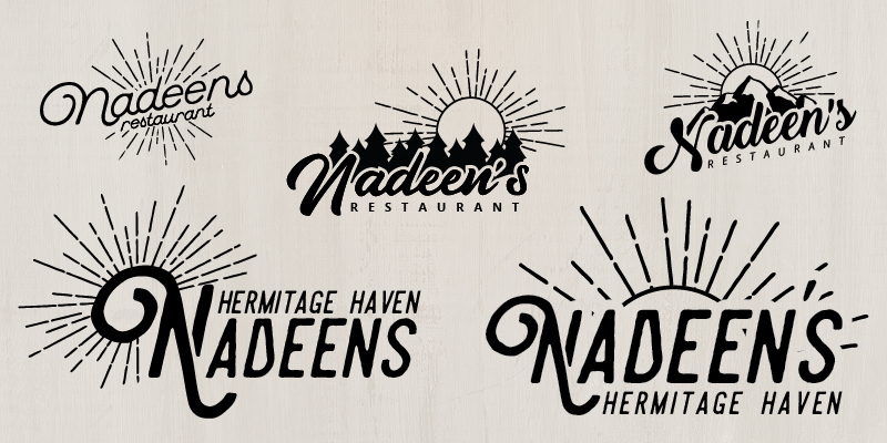
Nadeen’s was my first big project. I worked with the three original owners who all had different ideas for how they wanted the restaurant’s brand to look. The owners were looking for a brand that would ride the line between “hick” and “hispster” to attract a wider range of customers and to show off their personal passion and interests. Nadeen’s logo went through several variations, some of which are shown here.
The colors in the final logo were chosen to express the diner’s versatility as the perfect morning breakfast spot as well as a great location to indulge in the neighborhood’s night life.
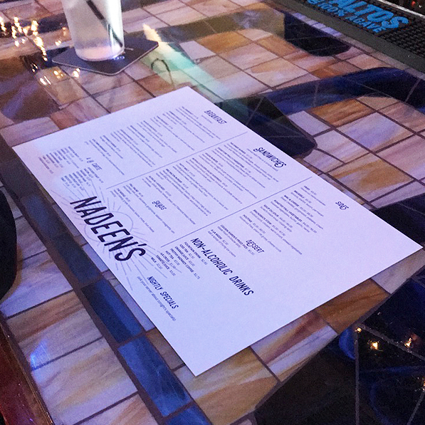
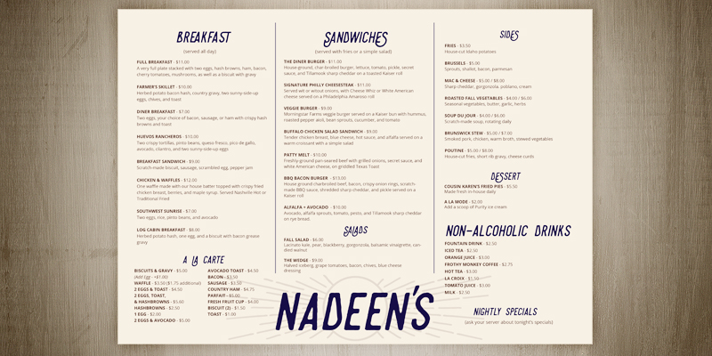
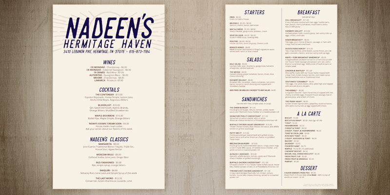
After the logo was finalized, the menu design was next. Nadeen’s originally had a horizontal “placemat style” layout. About a year later, the owners of the restaurant hired me for a second menu design, this time a vertical layout.
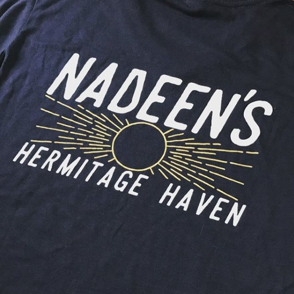
I also designed and mocked up the t-shirts that Nadeen’s employees wore. I even got to design some merch for management, like custom-ordered hoodies and beanies.
RESULTS
Nadeen’s is a popular breakfast, lunch, and dinner destination for locals in the growing Donelson/Hermitage area as well as tourists visiting Nashville year-round. The message of the brand was conveyed as intended and attracted the business’s target audience as well as others who appreciated the brand’s authenticity and commitment to fresh food and good company.